Hey everyone, I thought I would come on here and talk about some colored pencil tips that I have. It's hard to pick favorites in the mediums that I use, but colored pencils certainly rank high on my list. They're very versatile to work with and I've created some pieces that have turned out very successful. In this post, I will show some of the techniques I used to create my portrait of Luigi.


So here it goes! First things first, get to know your colored pencil set. Currently, my main colored pencils set is Prismacolored Pencils. I also have Verithin Prismacolored Pencils to cover small spaces and a Prismacolored Art Stix set to cover large areas. So how do you get to know your prismacolor set? You simply use them all. Many artists make the mistake of assuming the pencils will produce the exact color that are marked on the pencils or on the pamphlet that comes with them. The pamphlet, or even the color of the wood covering pencil, is just a helpful guide. Using the pencil is the only way you will know what color it will produce. If you don't test out all your pencils, you probably will end up loosing only half of your set.
When I first purchased my set, I decided to make a chart listing all the colors. It's very helpful to have because if I see a color that I would work, I can go to the chart and see how it looks used lightly or when it's burnished. I also left room to write in pencils from other sets and additional Prismacolor pencils that might be added in the future. Notice that I have the pencil's color code on the chart as well, it's important that when you're sharpening the pencils to start on the side that's away from the color code so you can easily replace it later on.
(Click on the chart to see the photo full sized on my flickr page. If you like, you can also download this chart on
Media Fire. I also have split up this chart into
three pages:
Page 1,
Page 2, and
Page 3.)
I also have this chart blank. I understand the convenience of a chart that's already filled out, however I would highly suggest that you take the time to get to know your pencils and fill out the chart yourself. Remember, colors can be interpreted differently from color monitors and printers.
(Click on the chart to see the full size photo on my flickr page. If you like you can download this on
Media Fire. I also have this chart broken up into three pages as well:
Page 1,
Page 2, and
Page 3.)
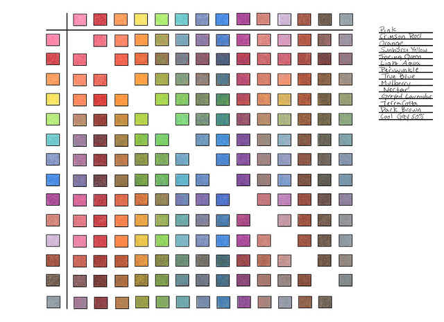
Another type of chart that I use is a Blending Chart.
This chart is helpful for finding a blended color that could work for your. On this chart, I designed it so the colors can be listed on the right. It's fun to play around with and see all the color combination that are possible. I like to apply the colors that are going across first, then the apply the vertical rows second. A blended color will be different if you lay a lighter color first to a darker color and vice versa. It's something to keep in mind while you're filling out the chart.

(Click on the image to see the full size on my flickr page. You can also download this chart on
Media Fire.)
Here is an example of how I filled out this color chart.
(Click on the image to see the full size on my flickr page. You can download this chart on
Media Fire.)
OK, So these charts are fun and all but how to you put them to use? Well here's the next tip! If I'm working from a photo, like with Luigi's portrait pictured earlier, I like to adjust some things in Photoshop first. Just jumping in a putting the pencil to paper might hurt you in the long run. It's best to have a plan of action and to experiment with colors before starting the piece. It's helpful to take the reference photo and pixelate it first to find the colors that are in the portrait. To do this go to photoshop, select fliter, pixelate, and then mosaic.


I like to take strips of the paper that I plan to work on and create color swatches with blended colors. Then I place them next to the mosaic reference photo.
Hope you guys enjoy these tips! You can always email me at erica@ericavojnich.com if you have more questions or leave a comment bellow!


